Distraction Nostalgia
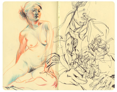
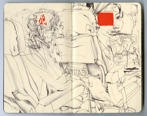
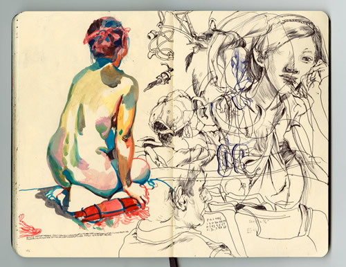
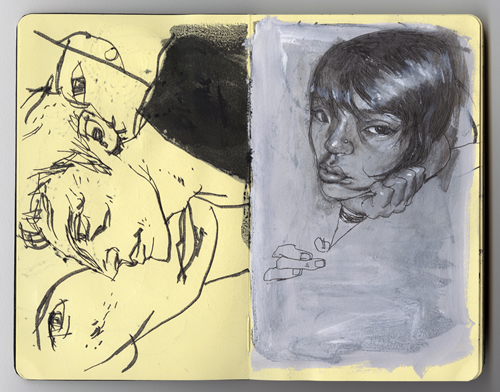
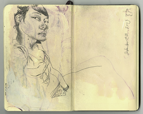
As a distraction from everything that’s been going on recently, I spent part of yesterday scanning old sketchbook pages from my art school days. Here’re some of the few I wasn’t so horrifically embarrassed about that I immediately pretended that they didn’t exist:
 One of the odd things about going through the sketchbooks was finding things that I had no memory or explanation for; this page above looks like it’s something I drew from observation, but I have no idea where it could’ve been, and if I made it up, I have no idea what it could’ve meant: what’s with the child’s bike? Why the off-kilter angle? What’s with the Elastica poster? Well, okay, I can explain that last one: I drew this around the time the album was released, and I had become obsessed with it, listening to it non-stop. But everything else? I have no idea.
 Another non-observation one, but I know where this all came from: It’s Rachel, from our Paris vacation on the Christmas following my 21st birthday. I don’t remember taking my sketchbook on that trip, though, so I’m guessing that this may have been done from memory, soon afterwards. This style of drawing was one that upset a lot of my teachers at the time, because they thought it was too scratchy and made it look like I didn’t know what I was doing (They were wrong).
I love the colors in this, self-importantly. Ignoring the impossible positioning inside the car – Seriously, how did they get in that position? – what this reminds me of is my love of the phrase “kissing in cars,” which for awhile was one of things that kept appearing in various places for awhile. “Kissing in cars” came, I think, from a song lyric that I can’t remember anymore, but I have no idea why I glommed onto it the way that I did… I blame my girlfriend at the time, and that which happened at the end of many evenings out. Ah, those were the days, apparently; who could be surprised it showed up in my work?
For the masochists amongst you, there’re more of the images here.
Seeing The Unseen
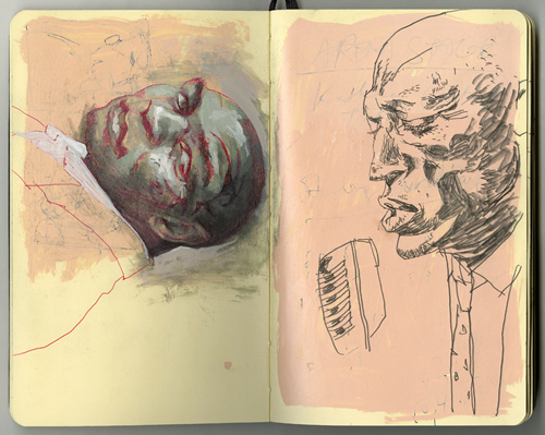
Back when I was at art school, I lived in sketchbooks more than my “finished” work; I found it easier and more comfortable to work out ideas there, leave things unfinished and mistakes visible, for some reason. Maybe that’s why I’m always obsessed with the chance to see the sketchbooks of professional artists whose work that I love. And, with work like this, who can blame me?
James Jean:
Look What You’re Doing
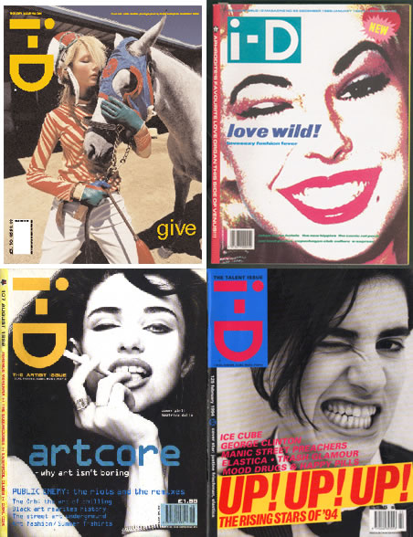
Apropos of a Twitter conversation with io9’s Julia Caruso, I found myself remembering the covers for Pulp’s This Is Hardcore singles the other day; the Chip Kidd-esque split images, the unsettlingly intimate photography (which gained a new meaning from the title of the single) and the sobriety of the type (with the band’s name only visible in relief, which I always thought was a nice touch, as if they were disappearing, somehow). This got to me to remembering how much pop music design influenced all my graphic design loves and choices when I was in art school, the way that it seemed to feed into what I wanted to make and, at its best, somehow be exactly what I was into at the time I was into it.
The best example of this for me was Styrolouge’s designs for Britpop also-rans Menswear, whose singles were things of beauty, as superficial and surface and empty as the band’s music – and I say this as a fan, as someone who thinks that they were an amazing and amazingly underrated pop band – but just incredible pieces of design:
 The economy of the logo, the hidden type on the side of the image… Gorgeous stuff. Each of the singles from the first album looked like this, an image on a white background, with the logo placed over it, and the title of the single on the top left hand side below boxes, color-coded for each release. “Being Brave” was different, in that the logo was actually printed on the sleeve; for “I’ll Manage Somehow,” “Daydreamer” and “Sleeping In,” the logo was printed on the CD case itself, making the images clean on the sleeve underneath, which the graphic design student in me loved:
 (There was also the “Stardust” single, which had the logo printed on the sleeve in silver, fittingly for a song about superficial fuckers, but I couldn’t Google up a decent image of it.)
This was – and in many ways, still is – an example of perfect, ideal design for me. I fetishized these singles, more for the way they looked than the way they sounded (Again, fittingly for a band known more for being made up of former models than anything else). The album, when it came out, had a disappointing cover that deviated from this format and seemed ugly and pointless because of it, and in some ways it broke up my love affair with pop music graphic design until Julian House came along and did everything Primal Scream starting with Vanishing Point. Oh, other people could do smart, attractive covers – See Peter Saville’s “This Is Hardcore” covers above – but it took House’s retro clutter to make me feel like someone was designing just for me again.
Good design is like good pop music. You take it personally, and think someone understands. For awhile, Menswear and Styrolouge made me understand that, and for awhile, they made me a better designer.
(And then I walked away and became a writer. But that’s another series of stories altogether.)
The Out Is Classic Design
Turns out the platonic ideal of 1950s pulp covers are the work of a man called Mitchell Hooks. Who knew? Well, these guys, but that’s not important right now. What is important is that we can all now join together in wishing that books still looked as awesome as this. Just look at the typography, even if you don’t dig the illustrations (Although, if you don’t, then you’re insane).
(Seriously, this is the kind of thing that the covers to Ed Brubaker and Sean Philips’ Criminal aspire to already, but I’d love to see many other comics manage this kind of design playfulness. Is that just me?)
In My Life, I’ve Been Them All
As I finished up my bachelors’ degree in art school – What you Americans call “undergrad,” I think? – I started to keep a comic diary; this was when I was (a) very into the self-mythologizing, and (b) also feeling very disconnected from everything that was happening in my life apart from school, so it seemed like a good idea at the time. I scanned some in, years ago, thinking I could put them online but never got around to it… Until now. Here’re three of them, to celebrate the mundanity and hair I had in my life back then.


 Looking at them now, what’s funny isn’t how much they remind me of that time in my life, but how obvious the Eddie Campbell and Dave McKean influences are to me. The first one, in particular, makes me kind of ashamed, it’s so blatant.
(Strange but true: The “Ring, fucker.” panel from the third one? That was the image on the business cards I gave out at my BA degree show.)
Because Stuart Immonen Demanded It!
So, artist, designer and all-round good guy Stuart Immonen came up with this unexpected way to celebrate Marvel Comics’ 70th anniversary:
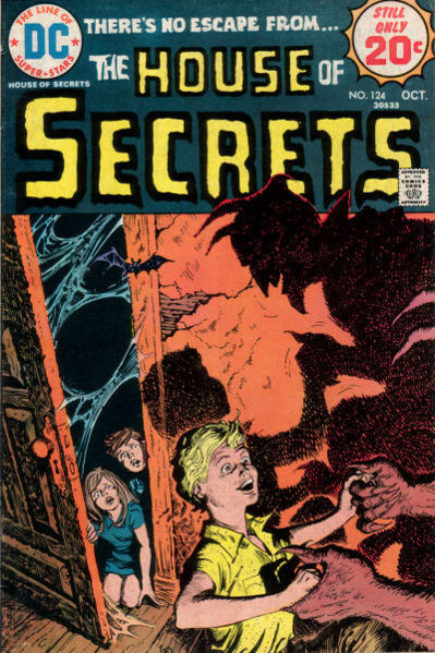
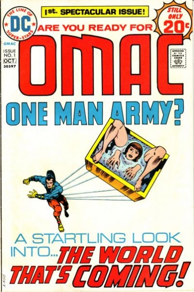
Here’s the deal. Remember the Typophile Album Cover Meme? This is much like that, requiring you to re-imagine a Marvel Comics cover from the last 70 years as an actual contemporary novel cover. Follow the steps below, and post the results on your own site or forum:
1) Click this link for a list of Marvel publications from a random month and year at Wikia.com (Link removed because I don’t understand Javascript and couldn’t make it work. Go read the original entry on Immonen.ca). Choose the 7th cover (if there are fewer than 7, choose the last one).
2) Search for the first word appearing on the cover that jumps out at you (this may be the title itself) on Flickr. Select the 7th (or last) image (as with the album cover meme, it’s best to select an image with Creative Commons rights released.
3) Use your favourite image manipulation app to create a new 6×9 image, incorporating the original title (and as much other original text as you like) and the new image.
4) Share!
Happy 70th Marvel Comics.
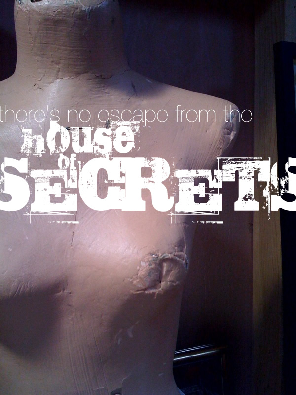
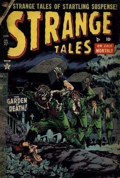
My year, 1954. My cover?
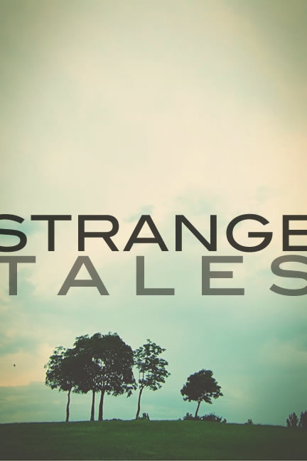 (I really didn’t have to do anything to the original image.)
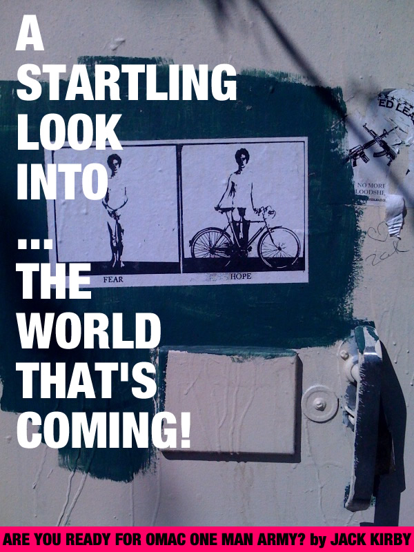
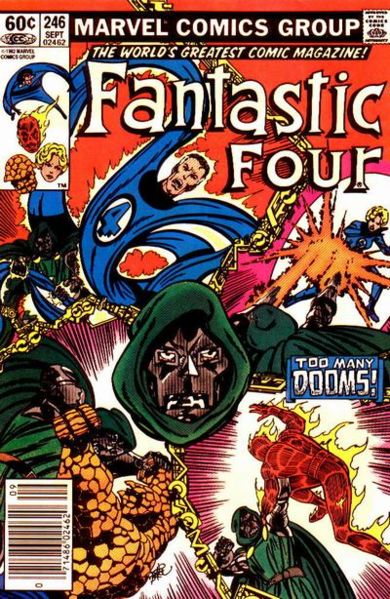
In fact, I had so much fun that I tried it a couple more times. Here’s the second original from 1982:
 (Original image here.)
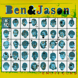
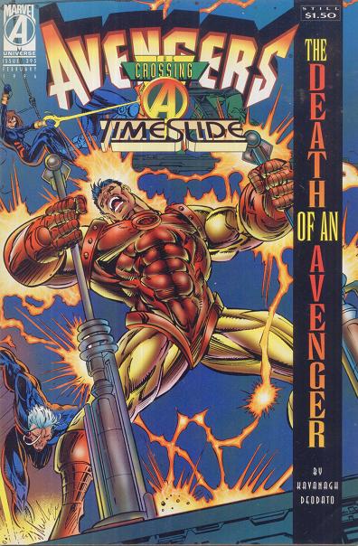
And the third, from 1996:
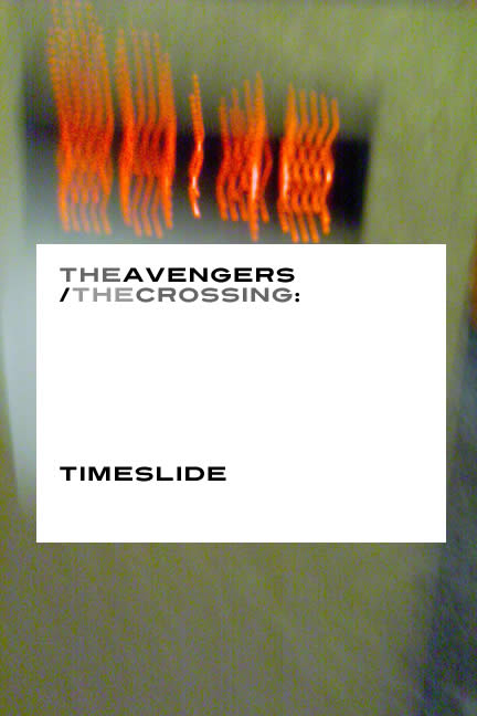 (Original pic here.)
I could honestly keep doing this for days, but then you’d get even more bored.

