Say Hello To The New Logo, Pretty Much Exactly The Same As The Old Logo
From a press release sent out by Marvel Comics just now:
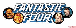
Marvel is pleased to provide your first look at the new logo making its debut on the cover of Fantastic Four #570 as a new era for Marvel’s First Family begins here!
Here is said new logo making its debut on the cover of FF #570:
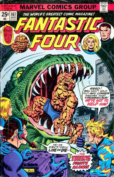
 Now, here is the cover from FF #161, from 1975:
And here’s letterer and all-round comic type expert Todd Klein talking about the above logo:
Still blocky, but now angled, with a telescoped drop shadow, and taking up about the same amount of space as the original FF logo. The letterforms are, to me, a game of “one of these things is not like the others.” I’ll give you a minute. Okay, all the shapes are squared block letters except the S, which is rounded. A very odd combination! There are some other odd things: look how wide the O is compared to the U, and the R has a right leg that seems to be trying to escape from the logo altogether.
So, wait, they didn’t even fix the “odd things” on the original? Yeah, that’s definitely one “new logo making its debut,” 34 years after it, you know, actually made its debut.
Related posts:

It’s still a heck of a lot more appealing than the logo that premiered with FF #554. I really like it.